

Bootwitch Portfolio — Illustrated Walkthrough
README · ARCHITECTURE · TECHNICAL · visual archive
Watch the short progression video, or follow the still images below. The video is a sequence of development artifacts, not a recording of live interactions.
A Working Structure
The earliest screenshot in this collection already shows the basic organization: files on the left, a terminal in the middle, and a document reader on the right. Projects, background information, and field notes live together in a workspace visitors can explore.
The interface also makes its simulation explicit. The demo says that no files are created. The terminal is a way to interact with the portfolio, not access to a real shell.
This version established the structure, but its presentation was still rough. The reader displayed Markdown markers and authoring annotations, and the thin green borders gave the workspace a much quieter visual identity than the version that followed.
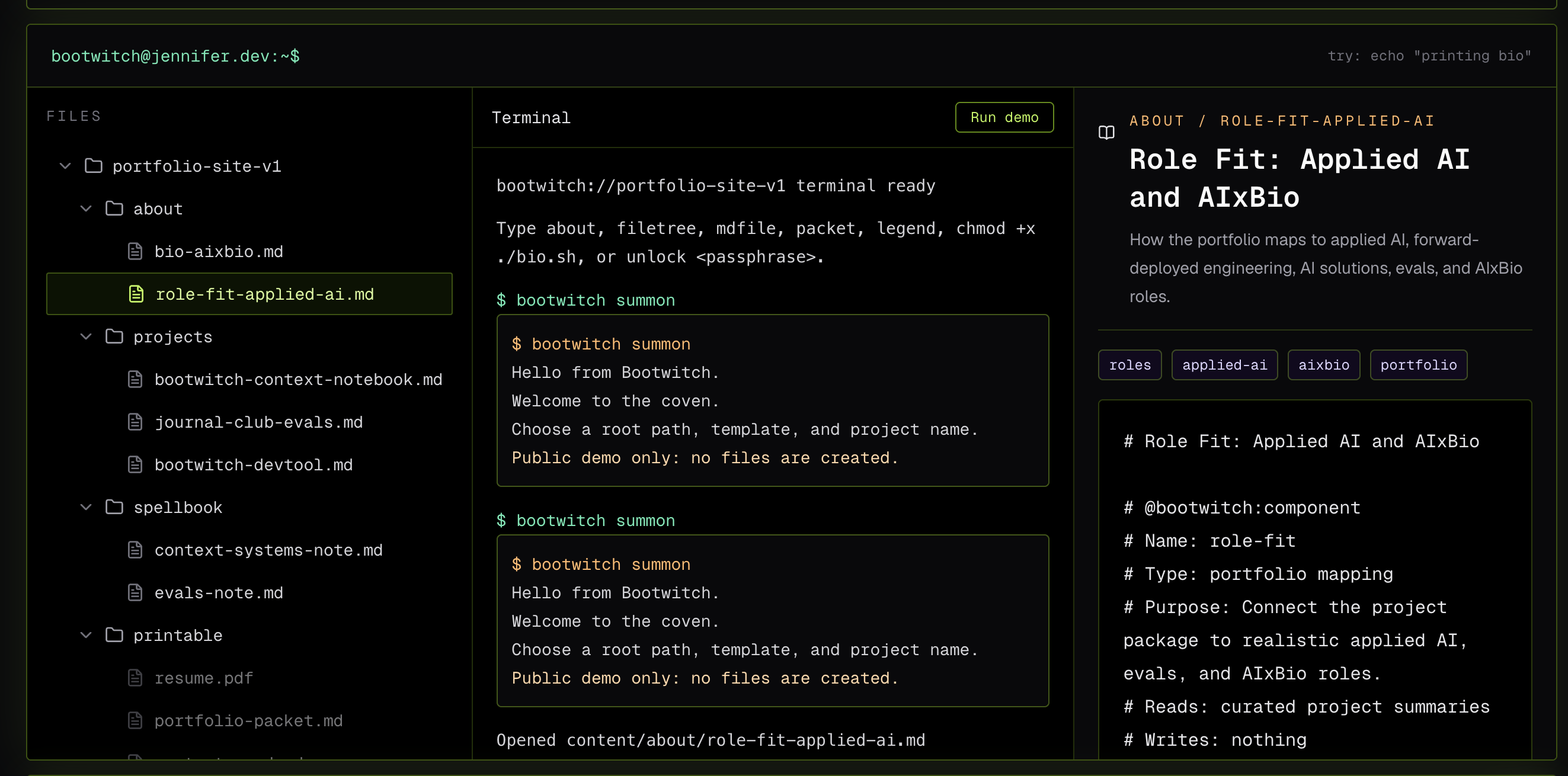 Early terminal-style portfolio with green borders and visible Markdown syntax.
Early prototype. The three-pane structure was already present; the content presentation and visual identity were still developing.
Giving the Interface a Recognizable Identity
The visual reference brought the BOOTWITCH personality into focus: an illustrated portrait, oversized orange lettering, angular borders, and a wand. The Files, Terminal, and Spellbook arrangement connected that artwork to the workspace structure.
The next challenge was making the artwork usable. I asked for a true editable SVG with a transparent background, with the portrait, lettering, icons, borders, and other elements separated where practical. The deliverable needed to be something we could work with as the site evolved.
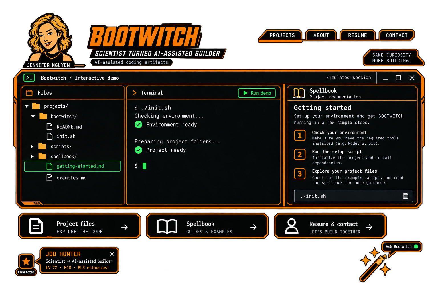 BOOTWITCH visual reference with portrait, orange wordmark, three panes, and decorative wand.
Visual target. This image established the style; it is a mockup, not a screenshot of the working site.
The First Attempt Was Part of the Process
The first vector reconstruction was a useful attempt, but it did not preserve the character of the reference closely enough. The portrait was heavily simplified, the lettering changed, and several proportions drifted. It had many of the requested parts without yet feeling like the same design.
I asked for another pass using the supplied image. That second pass followed the portrait and custom lettering more closely and rebuilt the interface around the reference's positions and spacing.
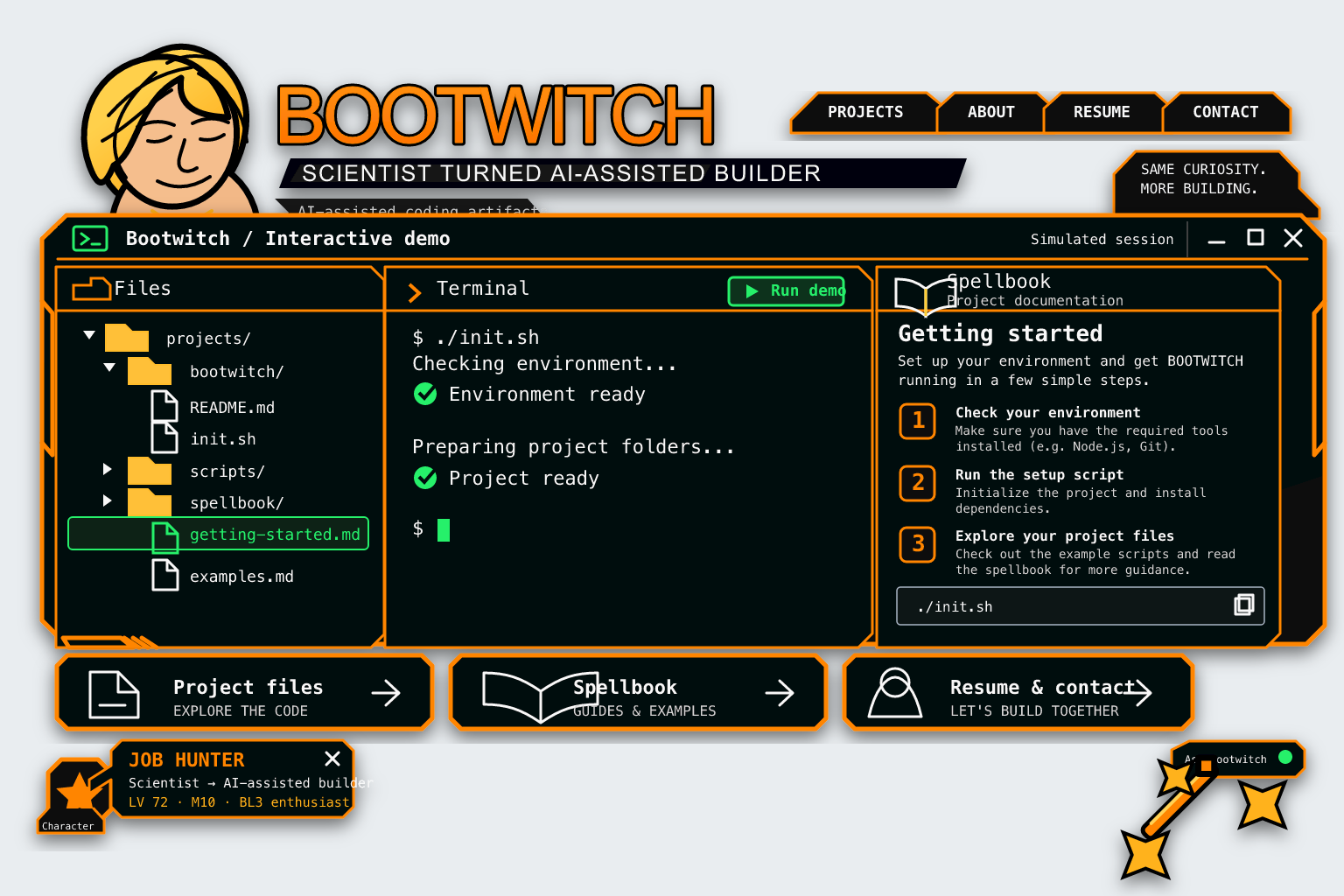 First SVG reconstruction, with a simplified portrait and mismatched proportions.
First vector attempt. The structure was editable, but visual fidelity still needed work.
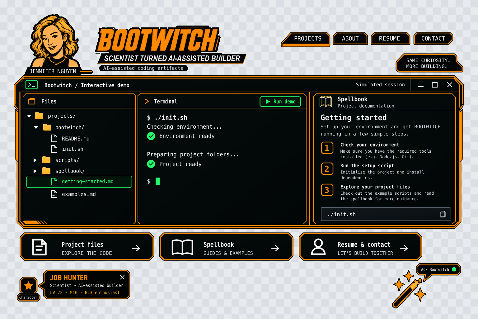 Refined vector reconstruction with the original portrait and lettering more closely preserved.
Refined vector artwork. The checkerboard is part of the preview and indicates the transparent outer canvas.
The result included an SVG with editable interface text and a second version with all lettering converted to paths. The portrait, logo, wand, and interface artwork remained vector geometry. That gave us both editable copy and a font-independent alternative.
Bringing the Design Into the Site
The later screenshots show the branded interface carrying actual portfolio material. The file tree contains project documents and field notes. The reader presents headings, tags, and paragraphs. The terminal has a welcome state, a demo button, and a command input.
The orange framing, portrait, and lettering carried over, while the content moved beyond the mockup's setup example. The line "Context systems · Evals · Developer tools" also made the subject of the portfolio more specific.
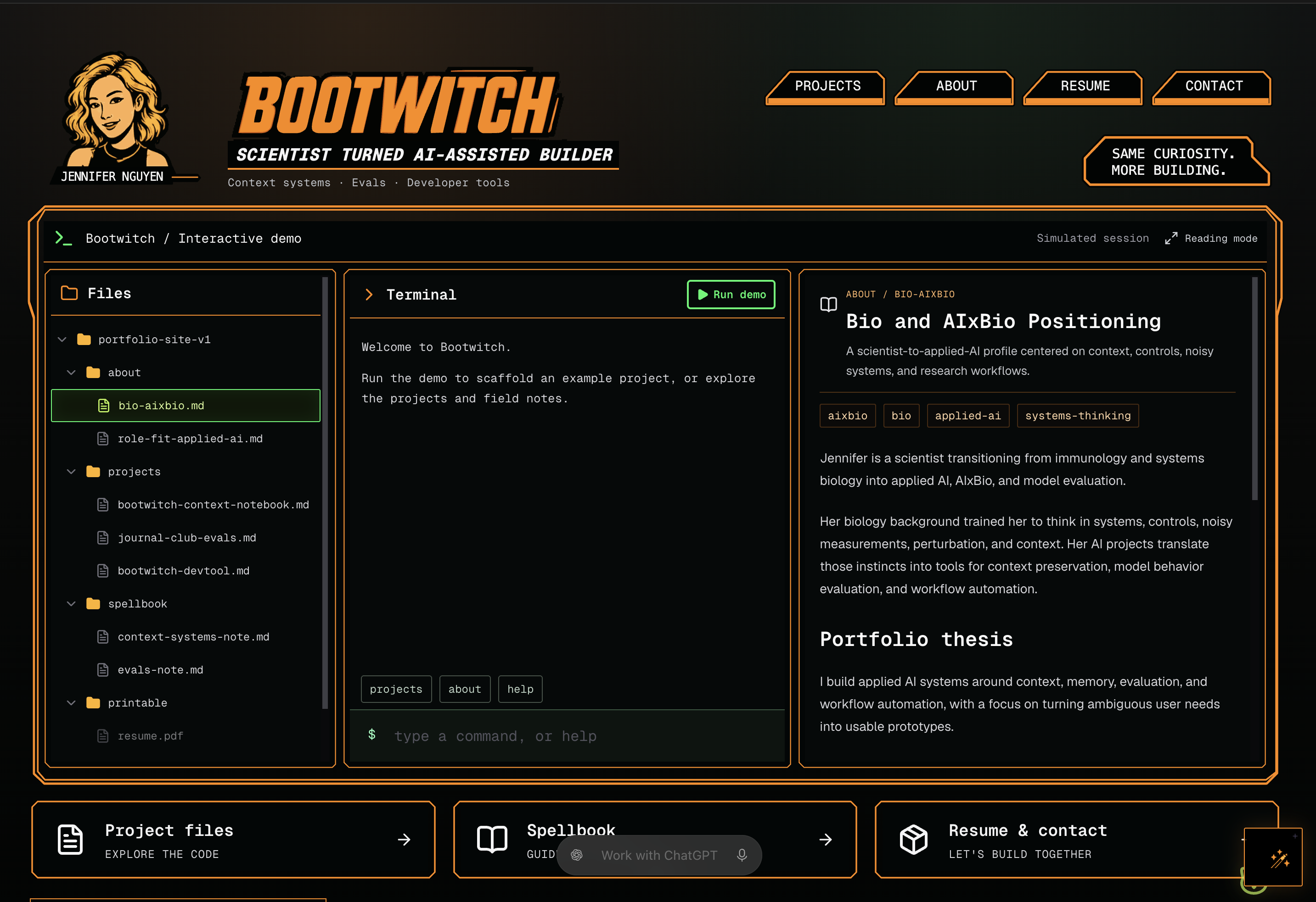 Branded BOOTWITCH portfolio showing project files, terminal, and a formatted biography.
Branded implementation. The visual direction now frames real portfolio content.
A Small Fix After Deployment
Once the site was deployed, the wand needed another adjustment. Its SVG frame was too wide and ended above the bottom of the handle. Correcting that frame made the whole illustration visible and centered it inside the existing button.
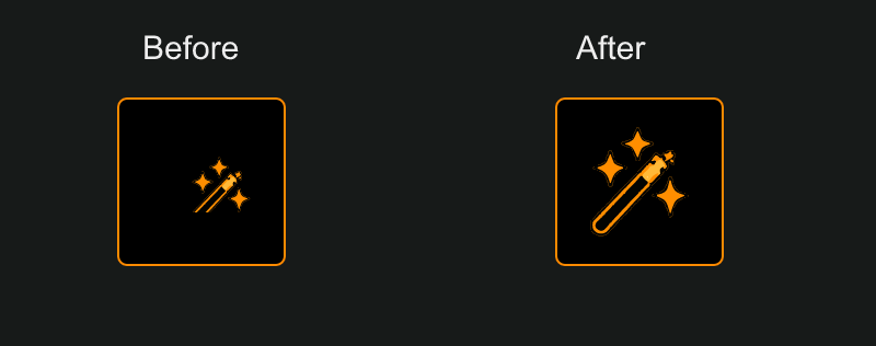 The small, clipped wand before the fix and the full centered wand afterward.
Finishing detail. The correction changed the SVG framing rather than enlarging the button.
What I learned
The structure could be right while the design still felt wrong. Comparing the attempts helped me name what had drifted, ask for a more specific revision, and keep going until the interface felt like the same idea I started with. The wand was a smaller version of that lesson: sometimes the artwork is fine and the frame around it is the problem.